01. The basics
A strong composition is crucial to a successful piece of art. It's what will attract a viewer's eye, and what will hold their attention once they take a closer look.
It can mean the difference between an action-packed piece of art and a solemn, contemplative one. But how do you make a composition convey the mood you want, and what is it that makes a composition successful?
There are a many long-standing rules regarding what makes a good composition, such as the Golden Ratio, the Golden Spiral and the Rule of Thirds. But they aren't really rules at all!
Think of them as suggestions… or better yet, as optional templates. Traditional methods like these are just one answer to a problem which has an infinite number of solutions. Their purpose is just to offer a simple method for an artist to use to make a more pleasing image.
I'll discuss some of these techniques, explain why they're successful and how you can use that knowledge to make a better image.
To begin, all you really need to know is this: a good composition is nothing more than a pleasing arrangement of shapes, colours and tones. That's simple enough really. Chances are, most of you can make a good composition with your eyes closed.
But we don't want good compositions, we want great compositions! We want to be masters of composition, bending it to our will. In order to do that, we need to understand the basic properties of composition...
By altering one of these squares, even slightly, I've created a much more successful composition in the second image. As simple as the image is, it already has a sense of motion, and depth. How?
|
Through relationships. By causing a disparity between the shapes, I've given the viewer a means by which they can compare those shapes. "This one is bigger, that one is lighter." The grey square appears to be moving and receding only when compared to the black square.
The process of comparing these shapes requires that the viewer moves their eyes repeatedly around the canvas, and therein lies the true goal of a great composition: controlling that eye movement. |
02. The Golden Ratio
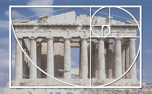
Let's look at the Golden Ratio. The idea was started by the ancient Greeks, who were strong believers in the Platonic concept of ideals.
They believed that all things, both tangible and intangible, have a perfect state of being that define them.
They also felt that one should always strive toward achieving this ideal state, be it in mathematics, one's physique, politics or aesthetics.
Like implied lines and contrasting values, colour can be used to draw the viewer's eye to anywhere we want
Greek mathematicians, after repeatedly seeing similar proportions in nature and geometry, developed a mathematical formula for what they considered an ideal rectangle: a rectangle whose sides are at a 1:1.62 ratio.
They felt that all objects whose proportions exhibited this were more pleasing, whether a building, a face or a work of art. To this day, books and even credit cards still conform to this ideal.
03. The Rule of Thirds
|
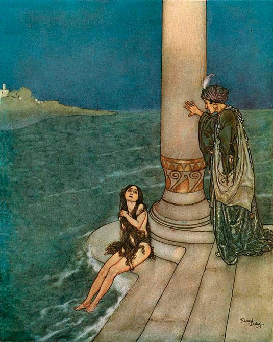
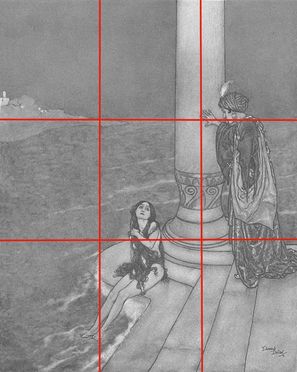
This states that if you divide any composition into thirds, vertically and horizontally, then place the key elements of your image either along these lines or at the junctions of them. You'll achieve a more pleasing arrangement. But does it work?
Let's look at Edmund Dulac's painting, The Little Mermaid: The Prince Asked Who She Was (above). Dulac was great at using empty space to his advantage, partly because he tended to abide by the Rule of Thirds. |
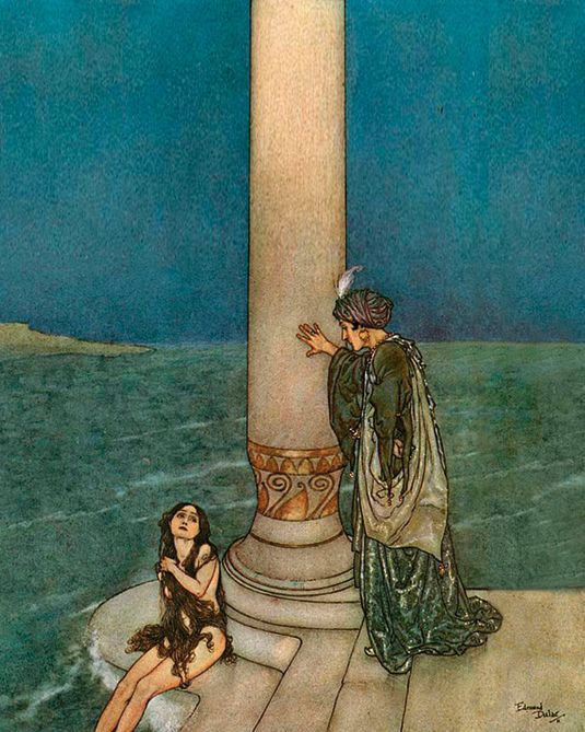
Here Dulac has placed the column and the horizon line perfectly along a line of thirds. But what if he didn't?
04. How the rules work
The Rule of Thirds works because it demands that the artist makes one element more dominant than another. This dominance creates an imbalance, and an imbalance of any sort will always attract the viewer's eye.
AdvertisementBisecting an image perfectly in half creates the least amount of interest, because everything is equally balanced.
Look back at those black and grey squares. The first composition is boring because it's too balanced. Making one area of your composition more dominant creates tension, and therefore adds interest. It also makes your eyes move around the canvas more to compare all of these relationships.
The fact that the composition is divided into precise thirds is really of minimal significance. You could divide a composition in fourths, fifths or even tenths. So long as there's some sort of imbalance, the composition will exhibit tension. As you'll soon see, this concept of imbalance applies to many aspects of composition, including value and colour.
05. Implied lines
|
These are probably the most important aspect of a composition, because you notice them first. When painting realistically, there's no actual line around a subject.
The illusion of a contour is a result of different values and colours contrasting. But even the impression of a line is strong, and our eyes will go to it and follow its length until it ends, or until it meets another line, which we'll follow again. A great composition makes strong use of this natural attraction to lines. |
|
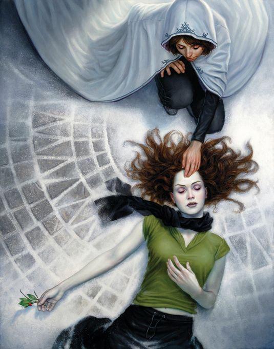
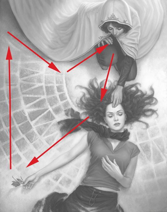
By creating strong lines for the eyes to follow, we can decide what path we want people to take and where we want that path to end. In this painting you can see a strong contour that follows along the cape, down the woman's arm, to our subject's face, down her arm, and then back up to the cape.
This creates a circular current that keeps the viewer's eyes flowing around the composition, holding their attention. That current also brings their eyes past every key element of the painting, one at a time. And don't forget, whether you're working for print or for websites, the borders of your composition are an implied line, too. |
06. Reinforcing those focal points
|
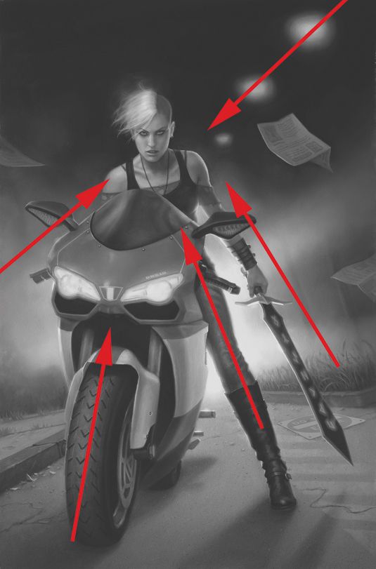
As well as using implied lines to draw the eye all around a composition, you can use the same method to make someone look immediately at your chosen focal point.
In fact, you can do it repeatedly, from multiple directions. This is particularly useful when your image is a portrait or a pin-up, and the character's face is the most important element. |
07. Threes are everywhere
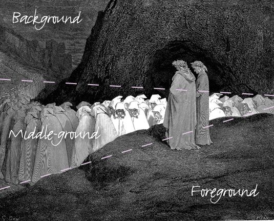
The Rule of Thirds seems to work its way into most aspects of picture making, and value is no exception. When constructing compositions, I tend to think in general arrangements of foreground, middle-ground and background.
To heighten the relationship between these three depths, I try to restrict each to a range of value, favouring black, white or grey. For instance, you can let the background predominately be white tones, the middle-ground predominantly greys and the foreground predominantly black tones.
Of course, any arrangement of these three values will work. By restricting your values in these areas you reinforce your image's sense of depth and make the silhouettes very easy to read – and that legibility is important.
Muddy values hurt the viewer's ability to discern shapes, especially at a small scale. That's why you'll see this technique used so often in trading card art. When your image is just a few inches tall, high-contrast compositions work especially well.
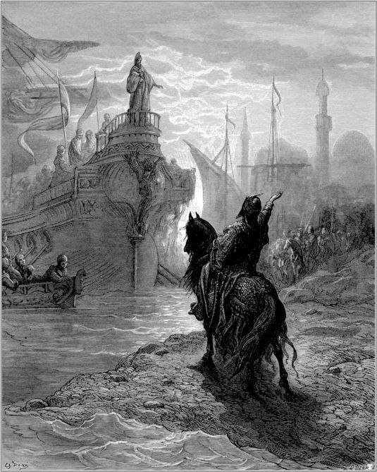
Triptych value schemes like this are readily apparent in the works of the Old Masters, particularly in the engravings of Gustave Doré.
His paintings all show different arrangements of black, white and grey to emphasise the difference between foreground, middle-ground and background.
08. Imbalance of values
|
Looking at the French artist Paul Gustave Louis Christophe Doré's engravings, not only has he divided his composition into three obvious layers of depth by using three ranges of value, he also creates an imbalance in the proportions of those values.
For instance, he may use a large amount of grey, and a small amount of white, but rarely equal amounts. This reinforces the importance of imbalance to create tension. By letting the composition be dominated by grey, the small accents of white and black garner more attention, and draw our eye toward the subject. |
09. The benefit of contrast
|
Black and white are inherently powerful tones. If you use them sparingly, and right next to each other, you can draw the viewer's attention to a particular spot with ease.
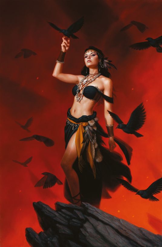
When painting, try reserving the purest whites and blacks for your focal point. For instance, if your main character has very pale skin, try placing something extremely dark on them, such as black hair or black clothes. This is one of the easiest and most successful ways of making your subject pop. In my painting Blood Divided, I did just this to make sure the heroine sat apart from the background. |
10. Making magic
|
Colour is an extremely powerful tool, and can inject a piece of art with mood and light. But it's also a strong compositional tool. Just like implied lines and contrasting values, colour can be used to draw the viewer's eye anywhere we want.
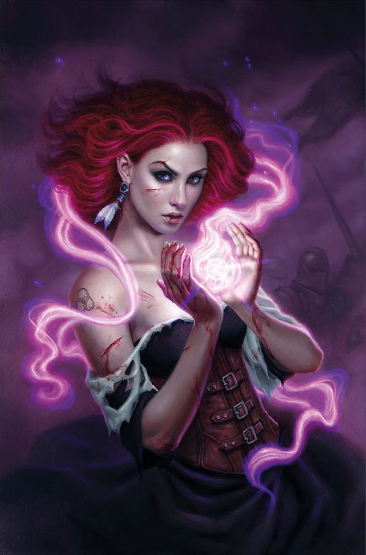
As mentioned before, disparities draw the viewer's eye. So, if there's a colour scheme in place that's predominantly red, any other hue (particularly a complementary green) draws attention to itself. Or you can create a disparity between levels of saturation, such as a mainly grey painting with high saturation in a small area. The greater the disparity, the greater the attention it receives. I often use this method to create the illusion of magic or dramatic lighting. A colour can appear intense simply by making the rest of the composition relatively desaturated, and/or complementary, in comparison. My painting Soulborn is primarily red and purple, yet everything besides the similarly hued 'magic' element has been slightly reduced in saturation. |
11. What's your angle?
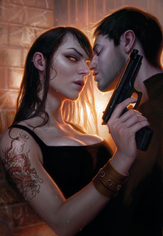
Imbalance can create a more exciting flow to your composition, but it can also add drama. The next time your painting isn't exciting enough, try tipping the camera angle.
Even the slightest tip to the horizon line can turn a mundane scene into a cool action shot. Experiment with the psychological impressions that different camera angles create.
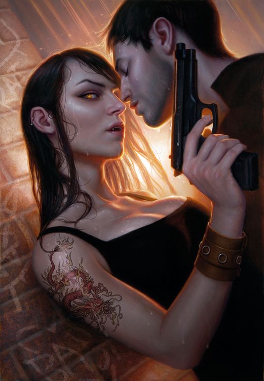
Straight, this painting lacks real excitement. The bricks, rain and hair all create simple vertical lines, and don't do much to enhance the drama of the piece. Tipping the image gives it a whole new feel.
Suddenly it appears like the woman is being thrust against the wall. There's also more of a sense of weight to their poses
12. Putting it all together
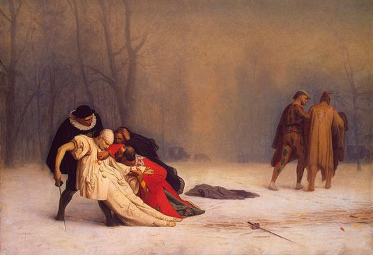
A good composition is one where the artist controls the movement of the viewer's eye to a beneficial result. We can do this by a number of means, such as reinforcing the focal point with the Rule of Thirds, implied lines, contrast of value and selective colour saturation.Putting all of these tools into action in a single piece, Jean-Léon Gérôme's Duel After a Masquerade Ball is the perfect example of using all compositional devices to your advantage.
RESOURCES
dandossantos.com/
http://www.creativebloq.com/digital-art/tips-composition-31514496/2
muddycolors.blogspot.co.uk
dandossantos.com/
http://www.creativebloq.com/digital-art/tips-composition-31514496/2
muddycolors.blogspot.co.uk
THE ASSIGNMENT
Your are being challenged to create a successful collage composition using the concepts from above. You will take images that were created for an intentional purpose and flipping the script to tell a completely new story.
Take the following into account when you are creating your collage
•WHAT STORY DO YOU WANT TO TELL?
•WHAT IS THE MOST IMPORTANT THING IN YOUR NEW IMAGE / WHAT DO YOU WANT THE VIEWER TO NOTICE FIRST? HOW WILL YOU GET THE VIEWERS ATTENTION? (CONTRAST, REINFORCING FOCAL POINTS, RELYING ON THE RULE OF THIRDS)
•WHAT IS THE SECONDARY FOCUS & HOW WILL YOU DRAW THE VIEWERS ATTENTION TO MOVE IN THAT DIRECTION ( IMPLIED LINES?, GOLDEN RATIO?)
•ARE YOU USING THE RULE OF THIRDS? WHY OR WHY NOT?
•HOW DOES YOUR COMPOSITION HELP TELL THE STORY OR TAKE AWAY FROM THE INTENDED STORY?
NEED MORE RESOURCES
21 tips for creating brilliant collages
Trend //Collage art

