You should strive to compose images that get attention and deliver your message.
In general, good pictures result from careful attention to some basic elements of composition, together with appropriate lighting and an interesting subject.
There is, however, no “right” way to take a picture. Three photographers recording the same scene may create equally appealing photographs with entirely different compositions. By understanding the basic rules of composition, you can incorporate them into the way you ‘see’ with your camera.
COMPOSITION in the visual arts is: the arrangement of elements and their relationship to the background of an image.
There are no fixed rules in photography, but there are guidelines which can often help you to enhance the impact of your photos. It may sound cliché, but the only rule in photography is that there are no rules. However, there are are number of established composition guidelines which can be applied in almost any situation, to enhance the impact of a scene.
These guidelines will help you take more compelling photographs, lending them a natural balance, drawing attention to the important parts of the scene, or leading the viewer’s eye through the image.
Once you are familiar with these composition tips, you’ll be surprised at just how universal most of them are. You’ll spot them everywhere, and you’ll find it easy to see why some photos “work” while others feel like simple snapshots.
Rule of Thirds
Imagine that your image is divided into 9 equal segments by 2 vertical and 2 horizontal lines. The rule of thirds says that you should position the most important elements in your scene along these lines, or at the points where they intersect. Doing so will add balance and interest to your photo. Some cameras even offer an option to superimpose a rule of thirds grid over the LCD screen, making it even easier to use
Imagine that your image is divided into 9 equal segments by 2 vertical and 2 horizontal lines. The rule of thirds says that you should position the most important elements in your scene along these lines, or at the points where they intersect. Doing so will add balance and interest to your photo. Some cameras even offer an option to superimpose a rule of thirds grid over the LCD screen, making it even easier to use
|
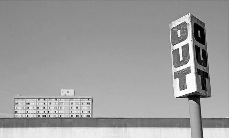
Balancing Elements
Placing your main subject off-center, as with the rule of thirds, creates a more interesting photo, but it can leave a void in the scene which can make it feel empty. You should balance the “weight” of your subject by including another object of lesser importance to fill the space. Here, the visual “weight” of the road sign is balanced by the building on the other side of the shot. Image by Shannon Kokoska. |
|
|
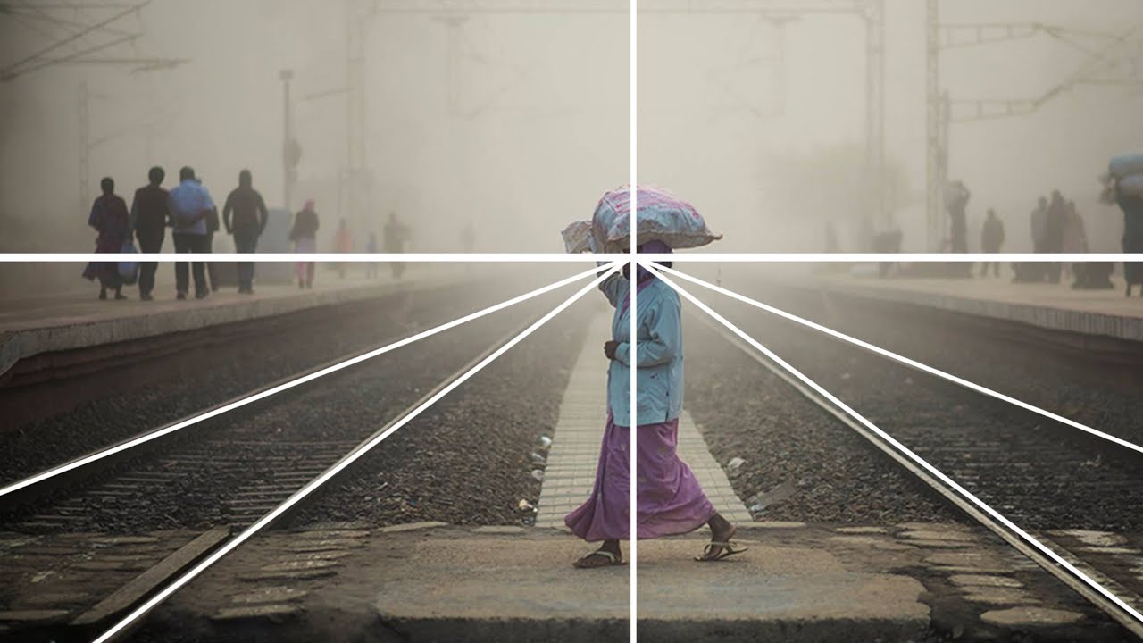
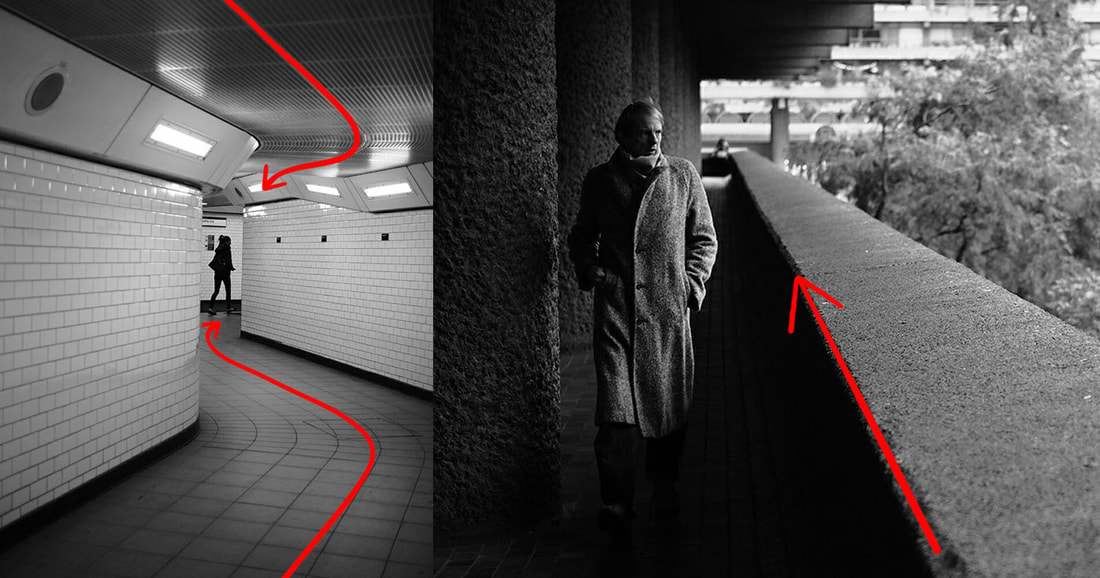
Leading Lines
When we look at a photo our eye is naturally drawn along lines. By thinking about how you place lines in your composition, you can affect the way we view the image, pulling us into the picture, towards the subject, or on a journey “through” the scene. There are many different types of line - straight, diagonal, curvy, zigzag, radial etc - and each can be used to enhance a photo composition. |
|
|
Symmetry and Patterns
We are surrounded by symmetry and patterns, both natural and man-made. They can make for very eye-catching compositions, particularly in situations where they are not expected. Another great way to use them is to break the symmetry or pattern in some way, introducing tension and a focal point to the scene. |
|
|
Viewpoint Before
photographing your subject, take time to think about where you will shoot it from. Our viewpoint has a massive impact on the composition of the photo, and as a result it can greatly affect the message that the shot conveys. Rather than just shooting from eye level, consider photographing from high above, down at ground level, from the side, from the back, from a long way away, from very close up, and so on. |
|
|
Framing
The world is full of objects which make perfect natural frames, such as trees, archways and holes. By placing these around the edge of the composition you help to isolate the main subject from the outside world. The result is a more focused image which draws your eye naturally to the main point of interest. |
|
|
Texture
No element of design is more capable of exuding emotions than texture. However, of all of the elements of design, it is the one most often overlooked. Texture gives an object a sense of being real and tactile. Coarse textures by exhibiting high localized contrast will have a rough character. Smooth textures with lower localized contrast will have a softer feel. |
|
ASSIGNMENT:
Three (minimum) NEW photographs that each adhere to at least three of the aforementioned rules.
At the critique, you will be asked to explain which ones you used (or abused!).
Here are some guidelines:
Three (minimum) NEW photographs that each adhere to at least three of the aforementioned rules.
At the critique, you will be asked to explain which ones you used (or abused!).
Here are some guidelines:
- There are no rules (huh?). If you want to break any of these rules, go ahead. Just be prepared to explain how and why at the critique. Every element in a photograph should be present, and where it is, for a reason.
- The eye is attracted to the largest, brightest, more favorably placed visual element in a photograph.
- Use any or all elements to unify the picture.
- All rules are overridden by rule #1.
- Remember, while a novice can achieve quality images with these guidelines, artists who really know them often find creative ways to break them with excellent results.
