UNDERSTANDING COMPOSITION
Photo composition refers to how objects and elements are placed relative to each other in your image. Good composition rules apply across all different types of visual art, from illustration to design. The goal of the principles of composition is to emphasize the parts of your image that you want your viewer to notice, and to create an overall feeling of balance when they look at the image.
Once you understand these rules of composition, you’ll begin to see why some photos just look better than others. A good composition uses a few of the photography composition tips we’ll go through. When going out to shoot your photos make sure to think about the kinds of subjects you usually shoot and how you can apply these tips.
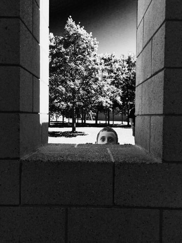
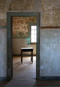
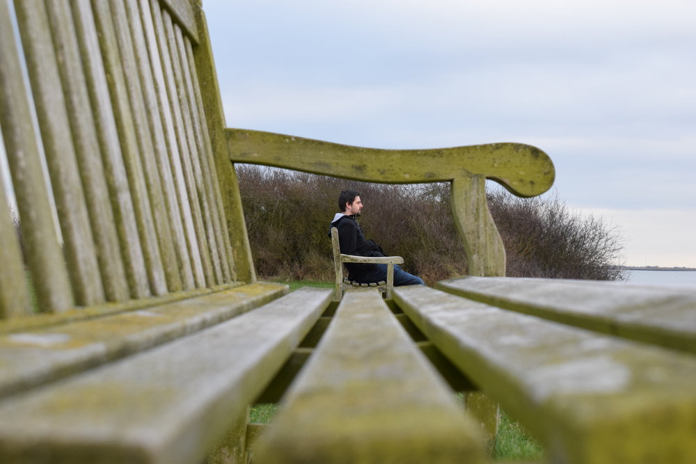
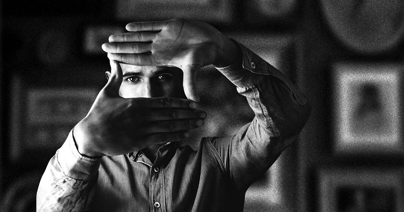
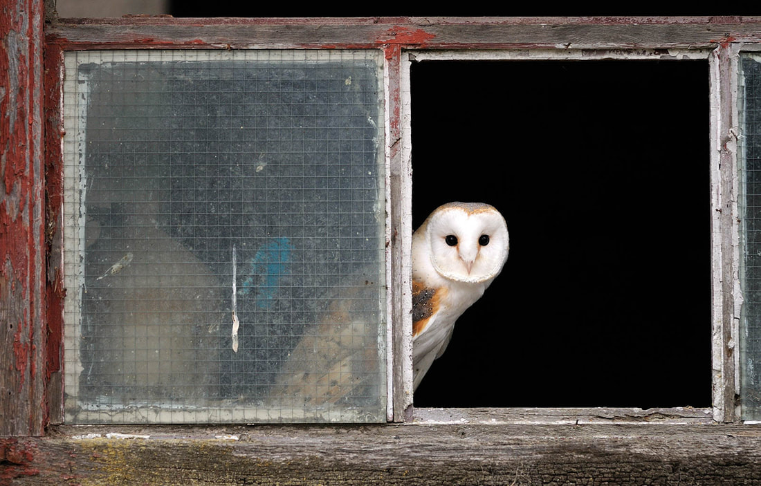
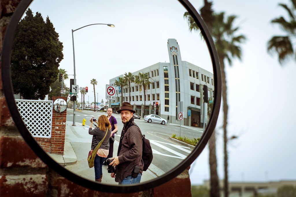
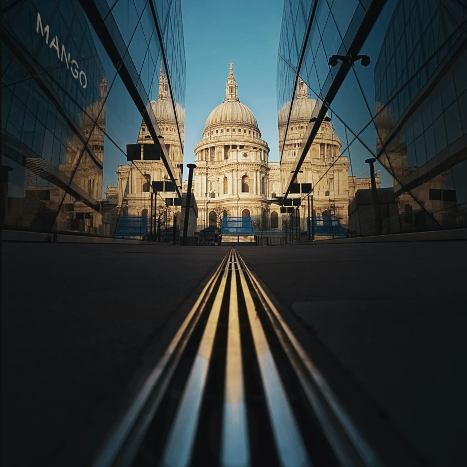
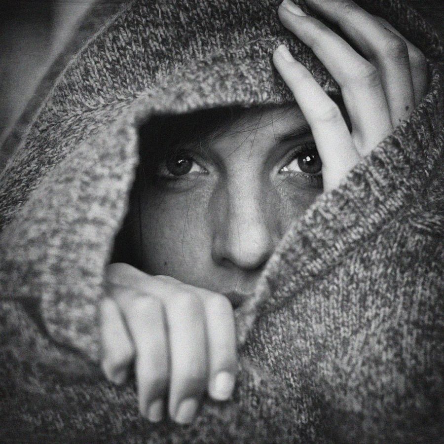
FRAME WITHIN A FRAME
A composition photography principle you’ll definitely want to get familiar with is using frames within the frame. Almost anything can be a frame in your image composition. For urban photographers, a bridge, a doorway or even an ally can be examples of a framing elements you can use. If you are out in nature using flowers, trees, or other plant life can be used to create natural frame as well as help develop a sense of place.
As a viewer we like to know where we are suppose to be focusing our attention and where the story begins. . By using a frame within a frame in your photo composition, you’re creating an element that emphasizes the importance of your main subject in a way that is visually appealing, without being distracting or taking away focus.

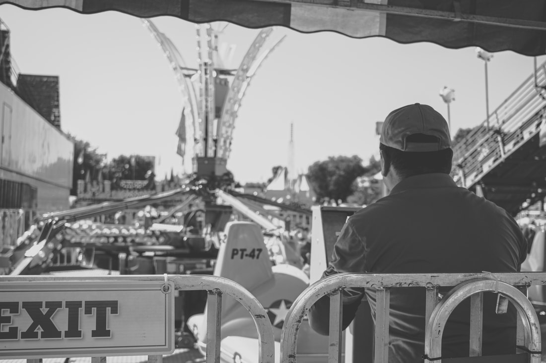

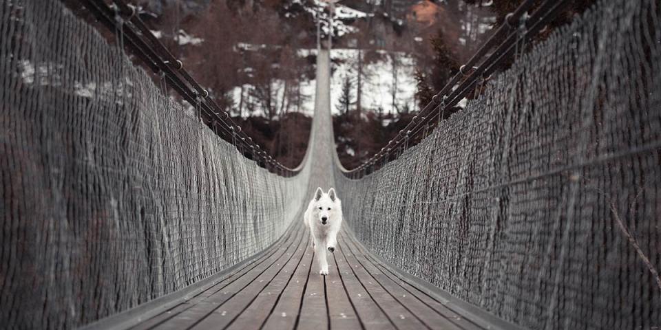
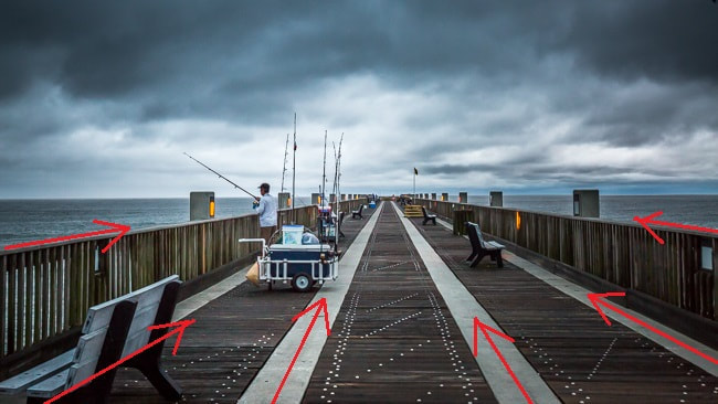
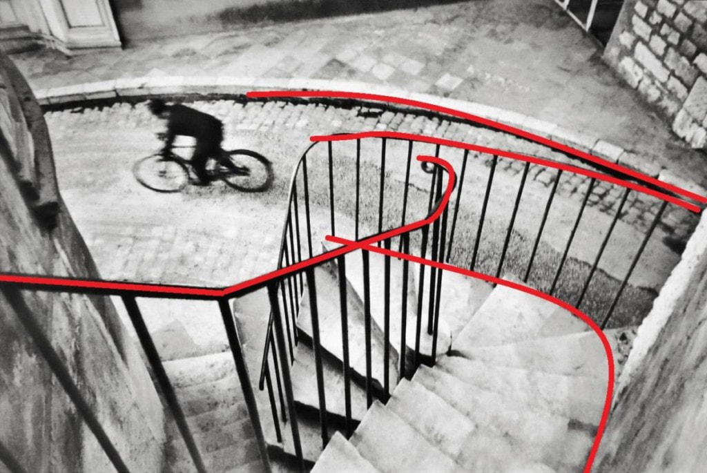
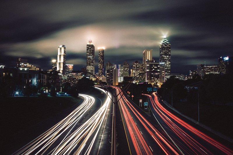
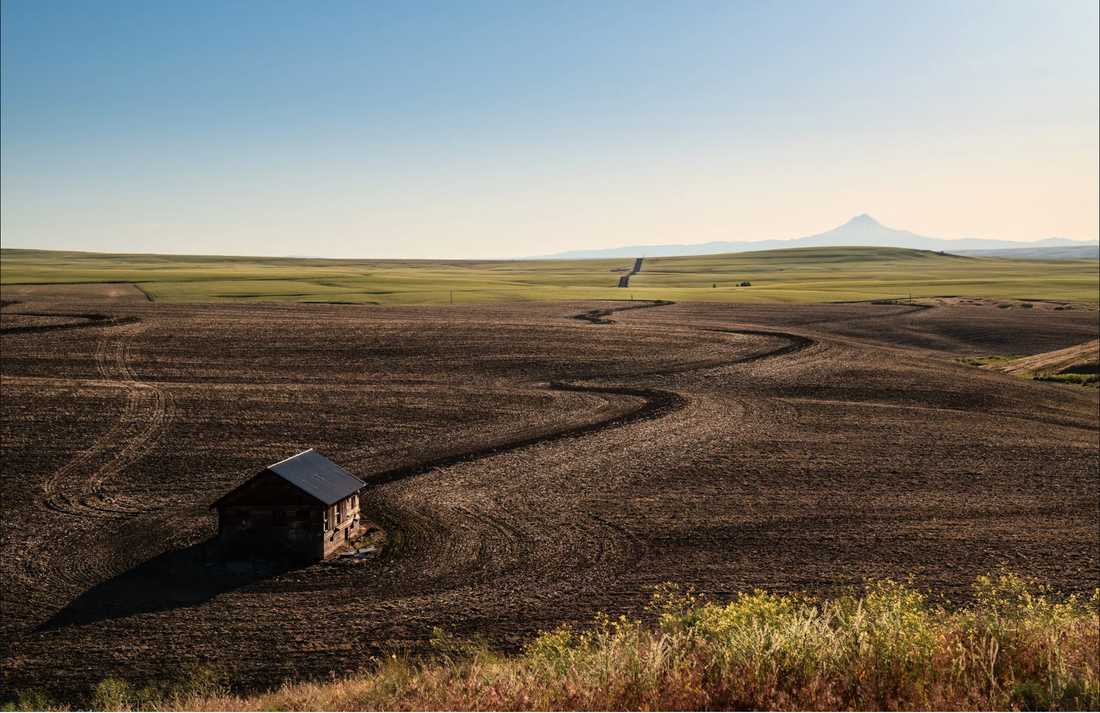
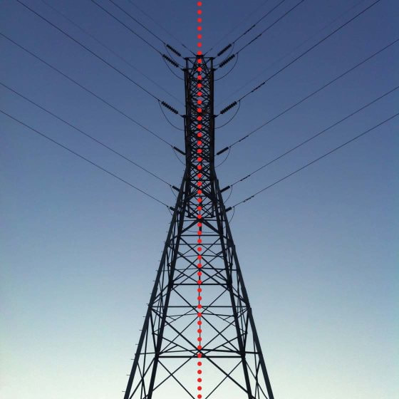
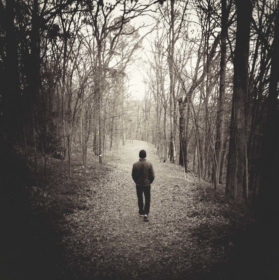
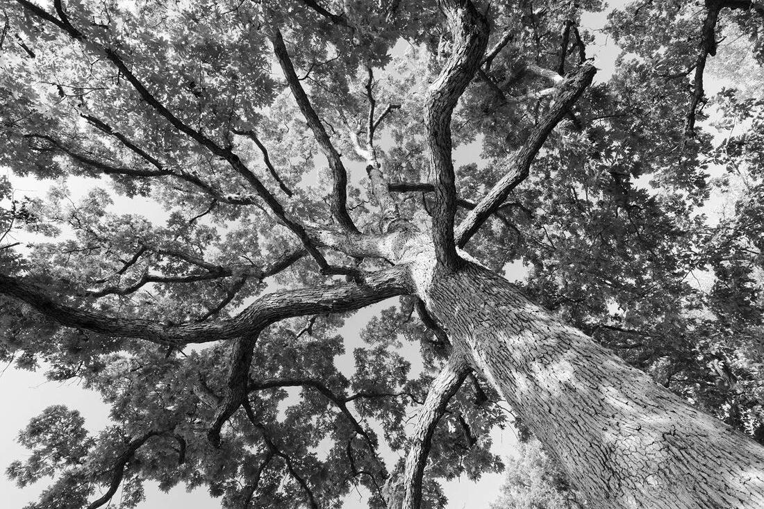
LEADING LINES
Leading Lines Basically refer to using natural lines or shapes to guide the eye towards your main subject. This forces the viewer’s eye to start at one end of the photograph and move to another end, as in diagonal or converging lines. Keep horizontal and vertical planes straight if you want to reflect reality (in other words, don’t tilt the camera to create diagonals). Because we “read” from left to right, “down” left and “up” right is sometimes said to be better (going up instead of going down)— you decide! Look for things like rivers, train tracks, doorways or shadows, and get creative!
Leading Lines Basically refer to using natural lines or shapes to guide the eye towards your main subject. This forces the viewer’s eye to start at one end of the photograph and move to another end, as in diagonal or converging lines. Keep horizontal and vertical planes straight if you want to reflect reality (in other words, don’t tilt the camera to create diagonals). Because we “read” from left to right, “down” left and “up” right is sometimes said to be better (going up instead of going down)— you decide! Look for things like rivers, train tracks, doorways or shadows, and get creative!


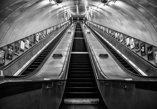

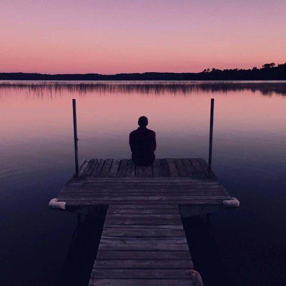
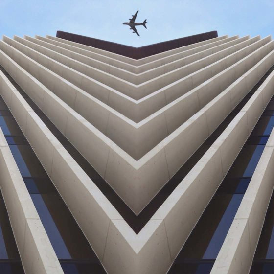
SYMMETRY
Imagine folding your photo in half and along the line of symmetry, if both halves were identical that would be an example of perfect symmetry. The thing is, is that in the real world isn't perfect and a composition doesn't necessarily have to be perfect to be considered symmetrical. If you can find a composition that closely replicates a pattern, object, or subject on both sides it is considered symmetrical balance.
In fact, a slight break in symmetry can be very appealing. A symmetrical image grabs attention. Once you have your viewer’s attention and they go in for a closer look, a break in the symmetry catches the eye and gives it somewhere to rest. Breaking the symmetry can also introduce tension to an image, which automatically makes it more interesting.


|
|
Wes Anderson doesn’t just make movies — he makes art. Central to that style is Anderson’s love of symmetry, highlighted beautifully by the viral video below.
Our brains are hardwired to love symmetry. We humans tend to judge physical attractiveness based on facial symmetry. Its effect is so powerful that “even infants as young as 4 months old recognize and prefer symmetry.” As a design technique, symmetry can be a kind of shortcut to creating impactful imagery. |
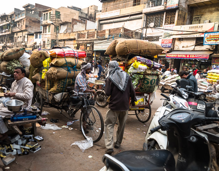
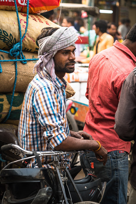
FILLING THE FRAME
As a photography teacher one of the most common issues with students photos are that it is unclear what I should be looking at as viewer. The background is either so cluttered that it is distracting or the "Main Subject" is taking up such a small portion of the image that it get lost in the frame. Understanding how much space to leave around your subject or how much to crop out is a learned skill that takes a bit of bravery and experience. Don't be afraid to get in close so you "FILL THE FRAME" so that you can clearly tell the viewer who or what your subject is.
Zoom lenses are obviously nice but moving your feet to get a bit closer is way cheaper! When you first start out getting close to your subject can be a bit intimidating. In the beginning practice with people you feel comfortable with or pets. One of the many benefits of getting in close with your feet is that you can get a much wider range of angles and perspectives than you can't do with just zooming.
Below is an example pulled from expertphotography.com. Compare the two images of a busy street in Delhi, India. Though the subject is the same in both images, the tighter crop focuses on the subject and still retains the context of a busy street in India.
|
VS |
|


THE ASSIGNMENT
For each composition technique you will be expected to create 4 unique and original photos that demonstrate each of the composition techniques.
DO NOT JUST DO THE SAME THING 2 TIMES to represent that technique (example: use hands to create a frame within a frame)
Consider using the rule of thirds while taking the photos or while cropping/editing
YOU NEED 2 OF EACH OF THE FOLLOWING COMOSITIONS
You will create a google slide document that will house all of the techniques in one document. See my example
Before you start uploading your photos ask yourself the following
For each composition technique you will be expected to create 4 unique and original photos that demonstrate each of the composition techniques.
DO NOT JUST DO THE SAME THING 2 TIMES to represent that technique (example: use hands to create a frame within a frame)
Consider using the rule of thirds while taking the photos or while cropping/editing
YOU NEED 2 OF EACH OF THE FOLLOWING COMOSITIONS
- FRAME WITHIN A FRAME
- LEADING LINES
- SYMMETRY
- FILLING THE FRAME
You will create a google slide document that will house all of the techniques in one document. See my example
Before you start uploading your photos ask yourself the following
- Do you find the images interesting?
- Will Nelson be able to understand what the subject is?
- Is there a story?
REFERENCES / LINKS
www.format.com/magazine/resources/photography/photo-composition
www.lightandmatter.org/2018/learn-photography/composition/photo-composition-leading-lines/
www.iphonephotographyschool.com/finding-symmetry/
www.thelenslounge.com/photography-composition-symmetry-tips/
www.expertphotography.com/fill-the-frame-composition/
