|
| ||||
THE FORMATIVES
Formative 1
|
Now that you are a color expert you will be challenged to use your knowledge to duplicate a small square to the best of your ability using tempra paint. You will be graded on the following: Color Accuracy, Proportions, Blending techniques, and overall Aesthetics of the piece.
|
|
Formative 2
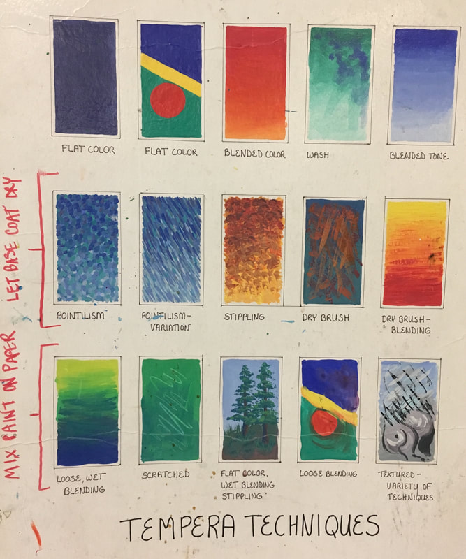
In class we will be creating a tempra paint technique sheet similar to the one below.
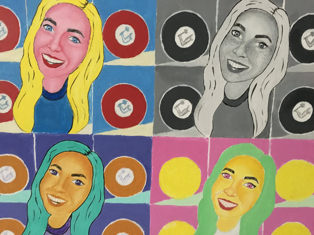
THE SUMMATIVE - POP ART!
BACKGROUND - A simple, flat, and recognizable image from your culture (Icon, Logo, Emoji, Etc.)
FOREGROUND- Something iconic to you friend, item, pet, etc. This needs to include a sense of dimension through shading.
|
|
THE COMPOSITION PROCESS
1. Decide what or who you are going to paint to be your foreground.

|
2. Decide what pop culture reference you are going to paint to be your foreground. Remember you want this to be more simplistic and flat
|
3. Decide how you will use your logo. Remember you do want it to be identifiable so don't cover up the whole thing. Feel free to play around with the placement and sizing to create the best possible composition
|
4. You can either draw your image or trace. Remember this is more about painting and content rather than drawing. This is just for the basic shapes and placements. You will be adding more shading and details with your paint 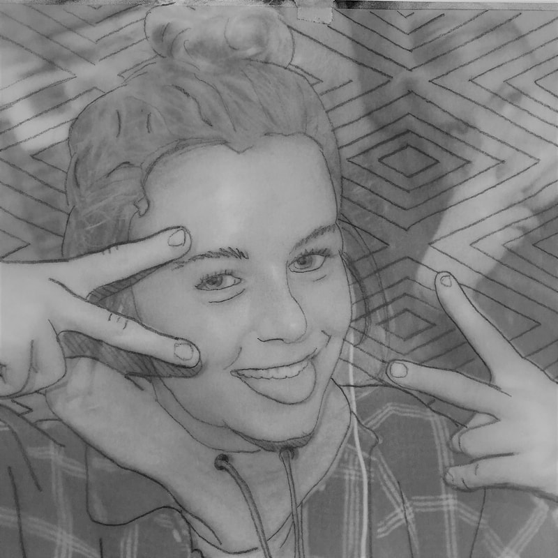
|
5. Combine the two and wahla you have your composition ready to start transfering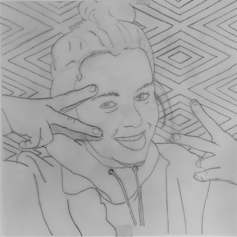
|
OPTIONS/VARIATIONS
Feel free to take your artistic liberties to alter the images to make them your own or guide a narrative.

|
VS |
|
You don't necessarily have to use a person for your foreground image. If you have an item that has significant meaning to you you could do a rendering of that.
too complex |
complex |

great balance of complexity |
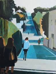
too simple |
